Branded Entry
Designing clarity and confidence for an airport parking experience that actually delivers.
Industry
Travel & Transport
Client
Skypark Melbourne
Service
Brand Identity
Date
May 2021
Challenge
SkyPark was building a better off-airport parking service — but the brand looked like every other budget carpark. Generic blues, dated gradients, and no visual structure left it feeling cheap, despite offering valet-level service and 24/7 support.
They needed an identity that reflected trust, calm, and ease — something that reassured travellers without screaming “big airport energy.”
Approach
I started by defining the emotional goal: takeoff without tension.
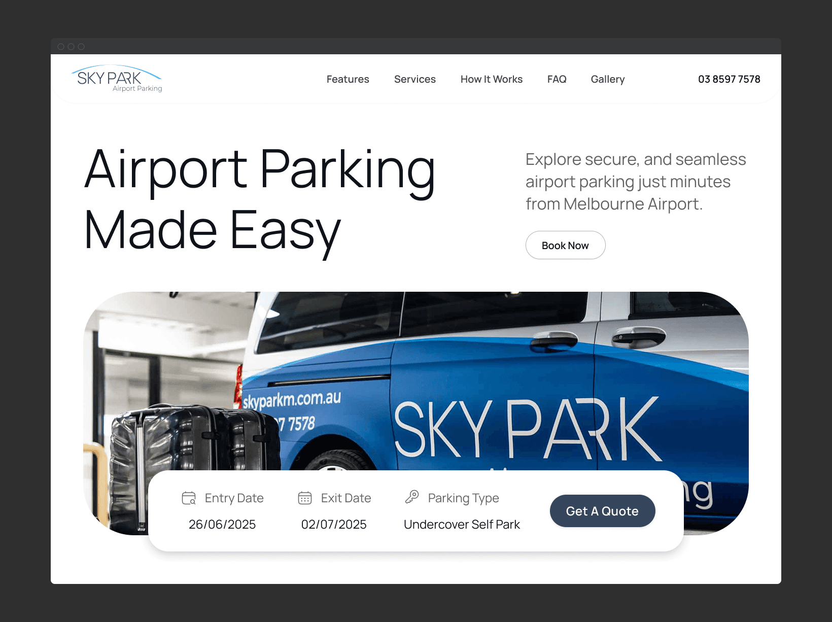
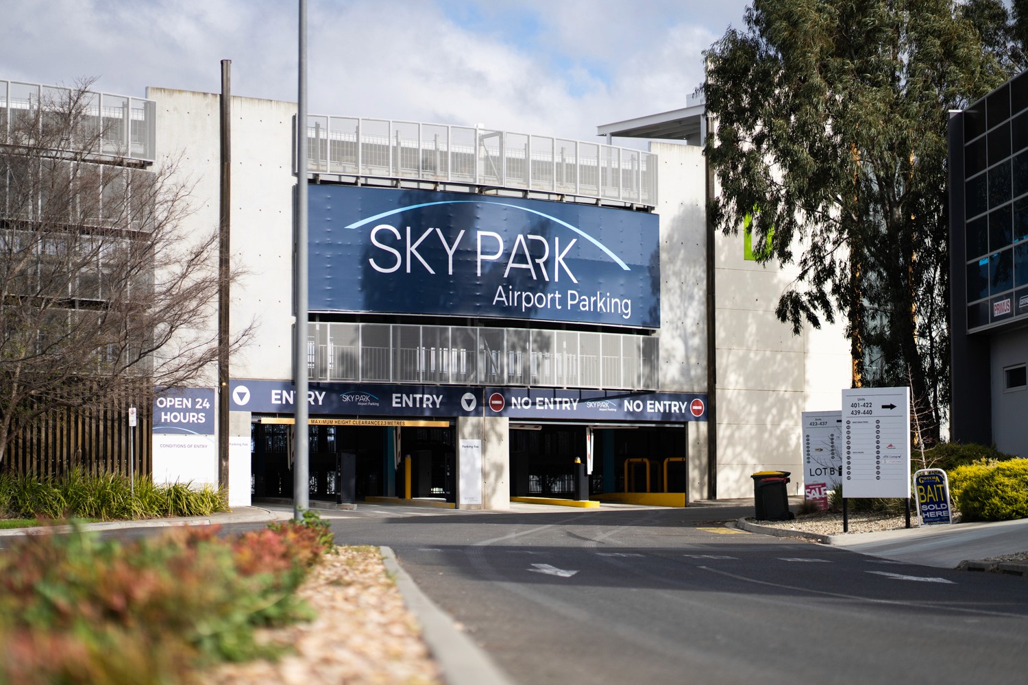
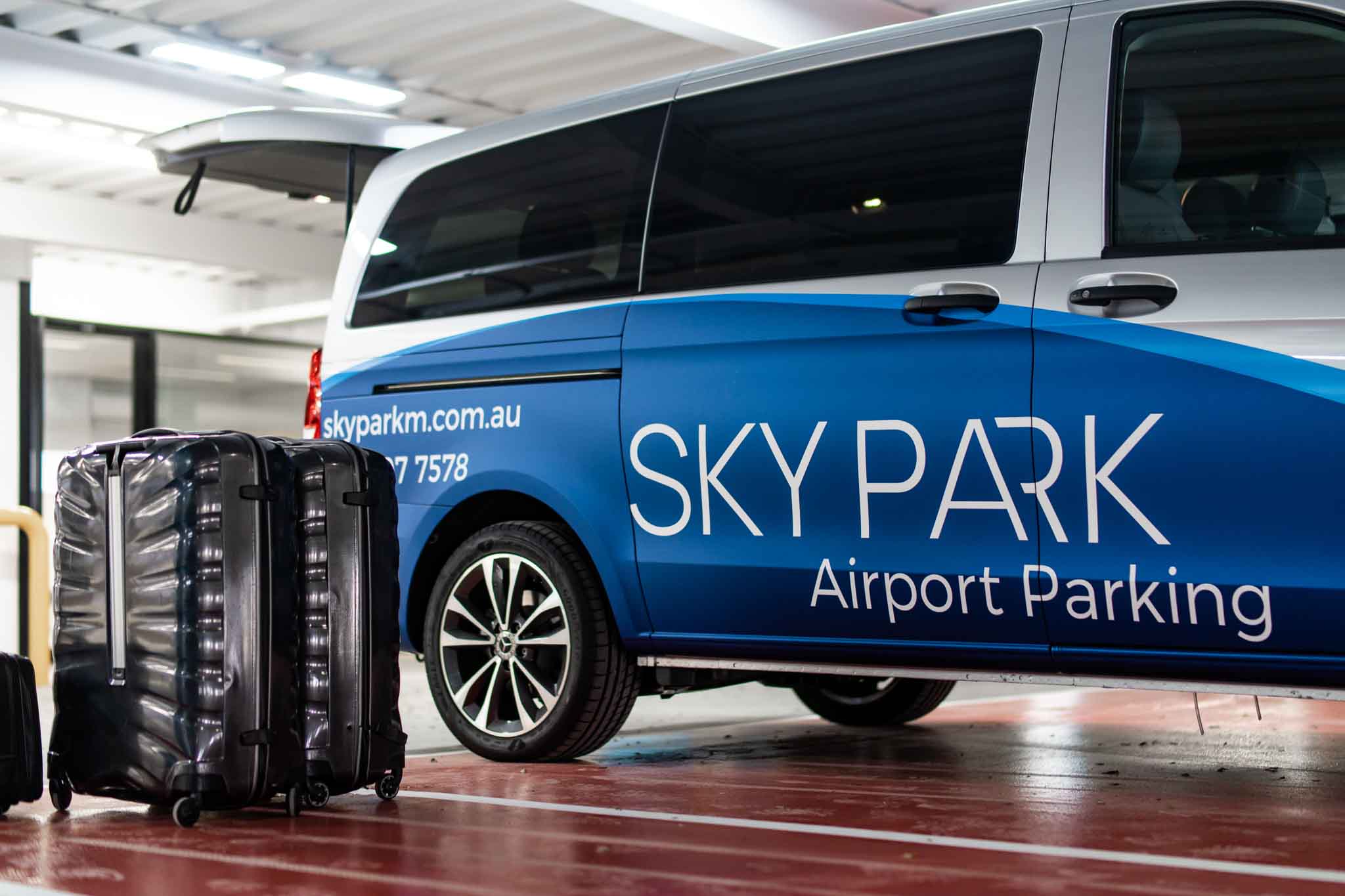
From there, I built a brand system around a clean, ark-shaped logo — symbolising safe passage from ground to air.
The colour palette draws from sky and sea — blues for calm, whites for clarity — while the typography is grounded and modern, with no fluff or fake luxury.
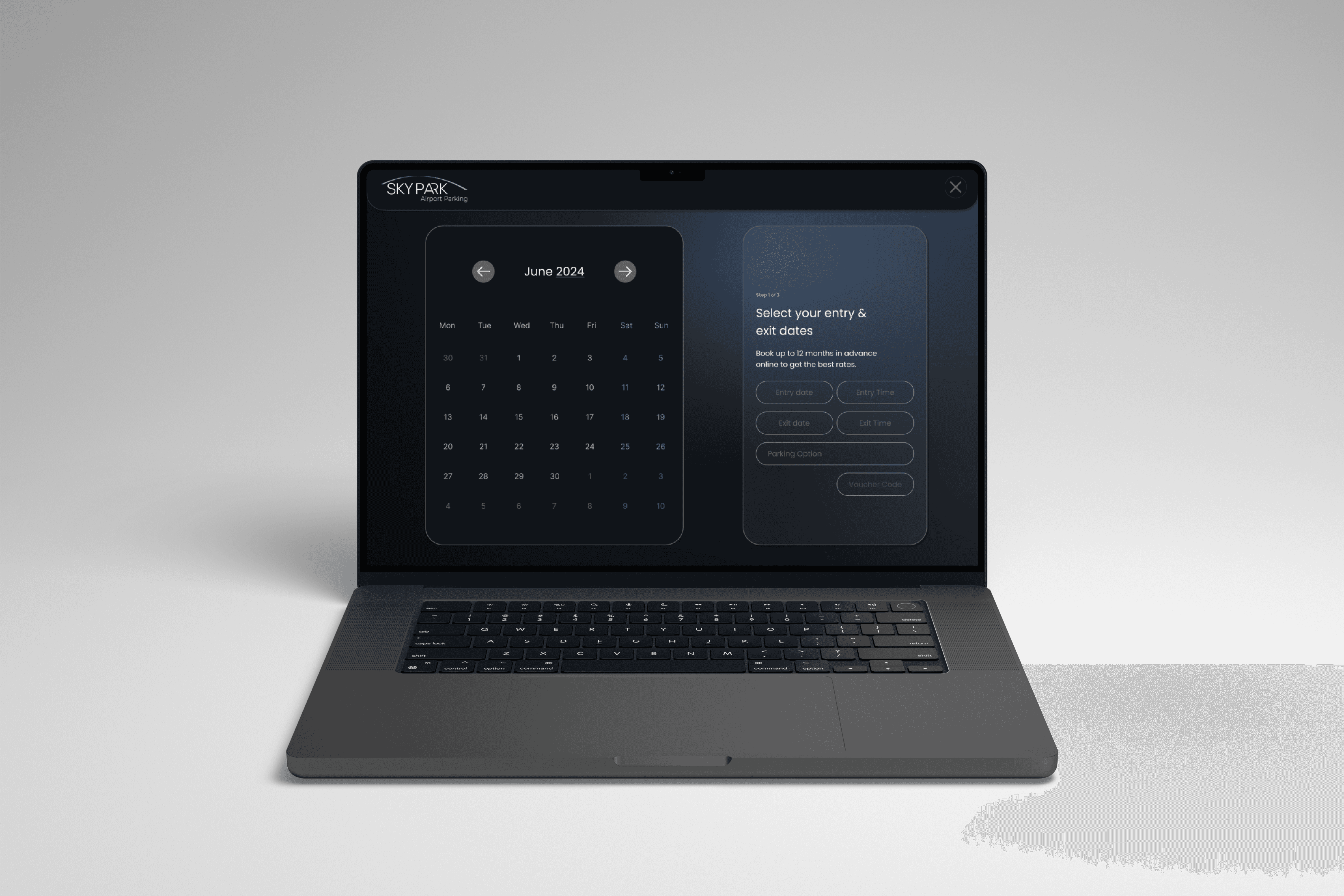
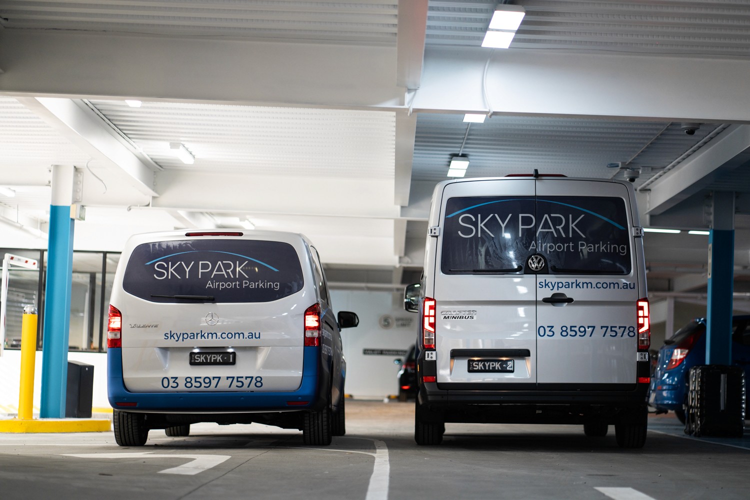
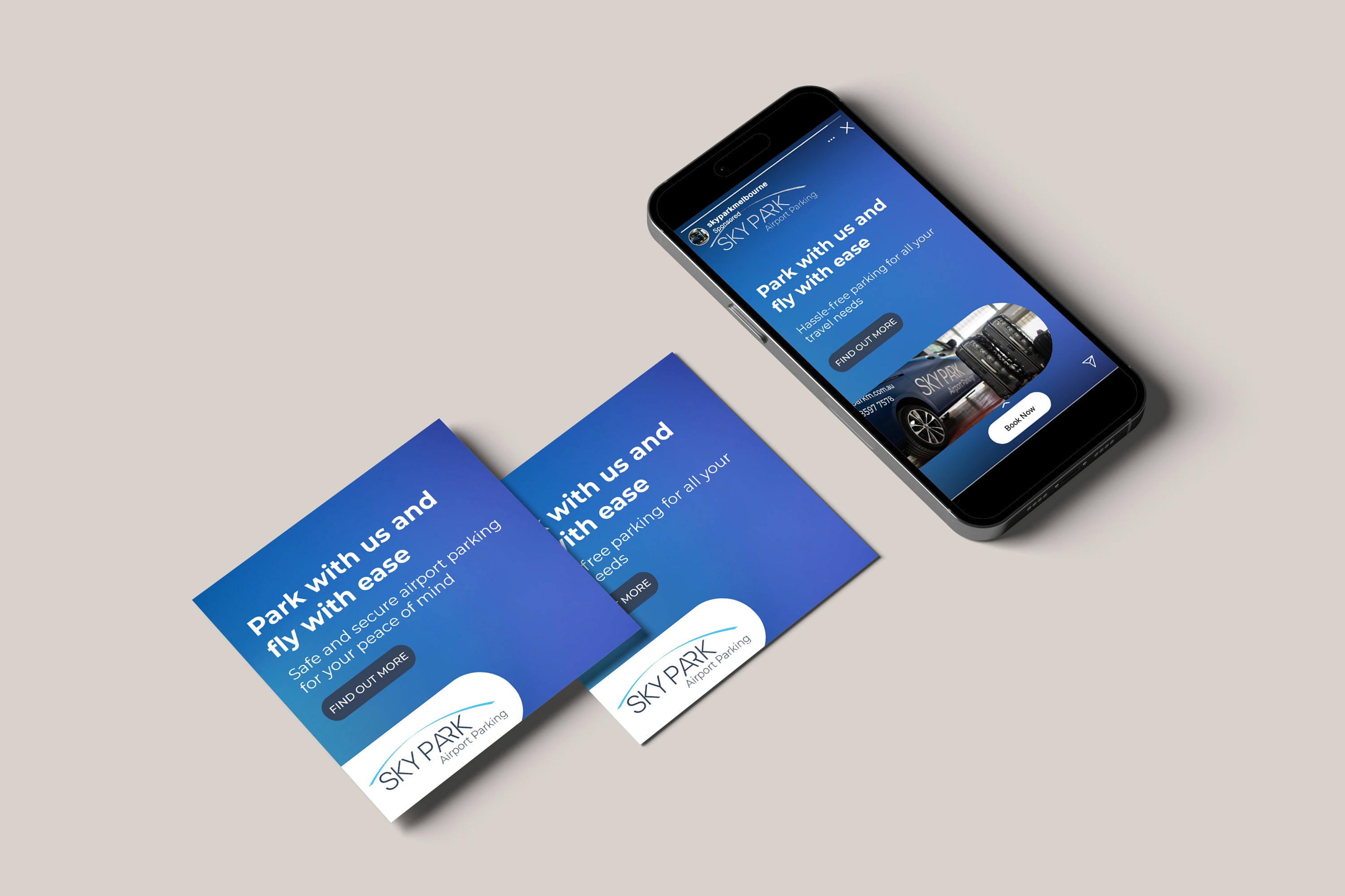
I applied the system across:
Staff uniforms
Signage and shuttle decals
Digital and print touchpoints
Internal documents and forms (for full alignment)
This wasn’t just a logo — it was the foundation for how the entire service showed up in the world, from the gate to the goodbye.
Outcome
The brand now communicates what SkyPark actually delivers: calm, clean, dependable service.
Internally, staff aligned fast — they finally had a visual system they could take pride in. Externally, the brand now holds its own against major airport providers without trying to feel corporate or cold.
Customers felt the difference too — consistently mentioning the “professional, simple” vibe even before stepping onto the shuttle.