Mobile Booking UX
A complete mobile-first UX/UI redesign of SkyPark Melbourne’s airport parking booking platform. The goal: reduce user error, eliminate friction, and introduce clear system feedback while building a more character-driven, branded experience optimised for conversion on mobile.
Industry
Travel & Transport
Client
Skypark Melbourne
Service
UI/UX Design
Date
August 2024
Challenge
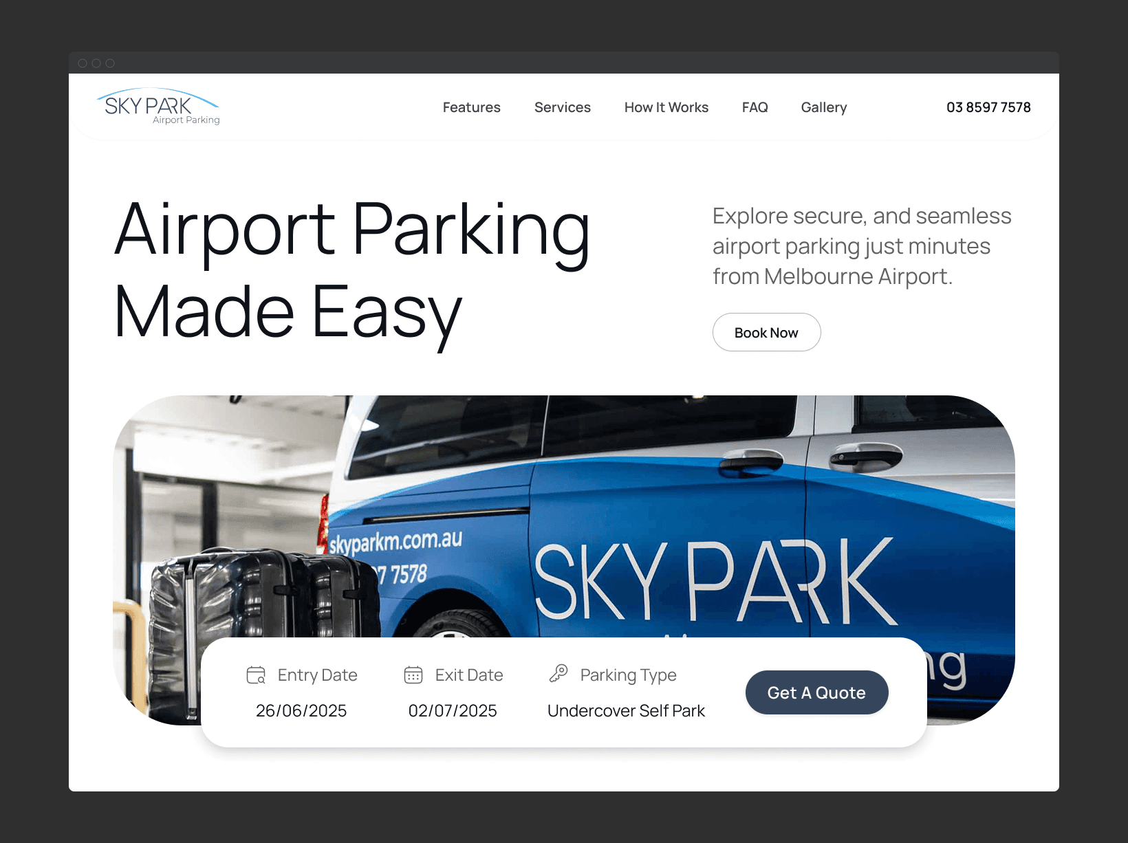
The previous booking interface lacked both functional clarity and brand character. Users were forced through a single-page, form-heavy layout that delivered no clear flow or hierarchy.
Key issues included:
High cognitive load from overloaded input fields and dense UI
Unstructured booking flow, leading to frequent errors in date/time selection
Low affordance and no progression logic — users weren’t guided or informed
High drop-off rates during peak conversion steps, especially mobile
Absence of micro-interactions or feedback cues (e.g. input validation, success states)

Approach
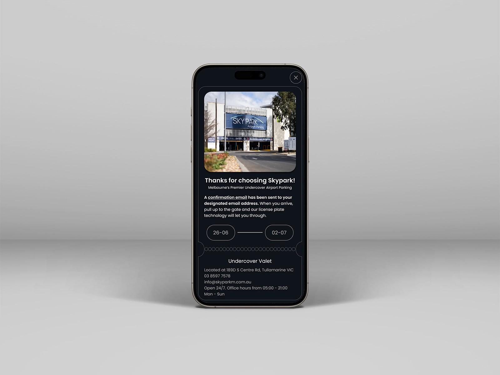
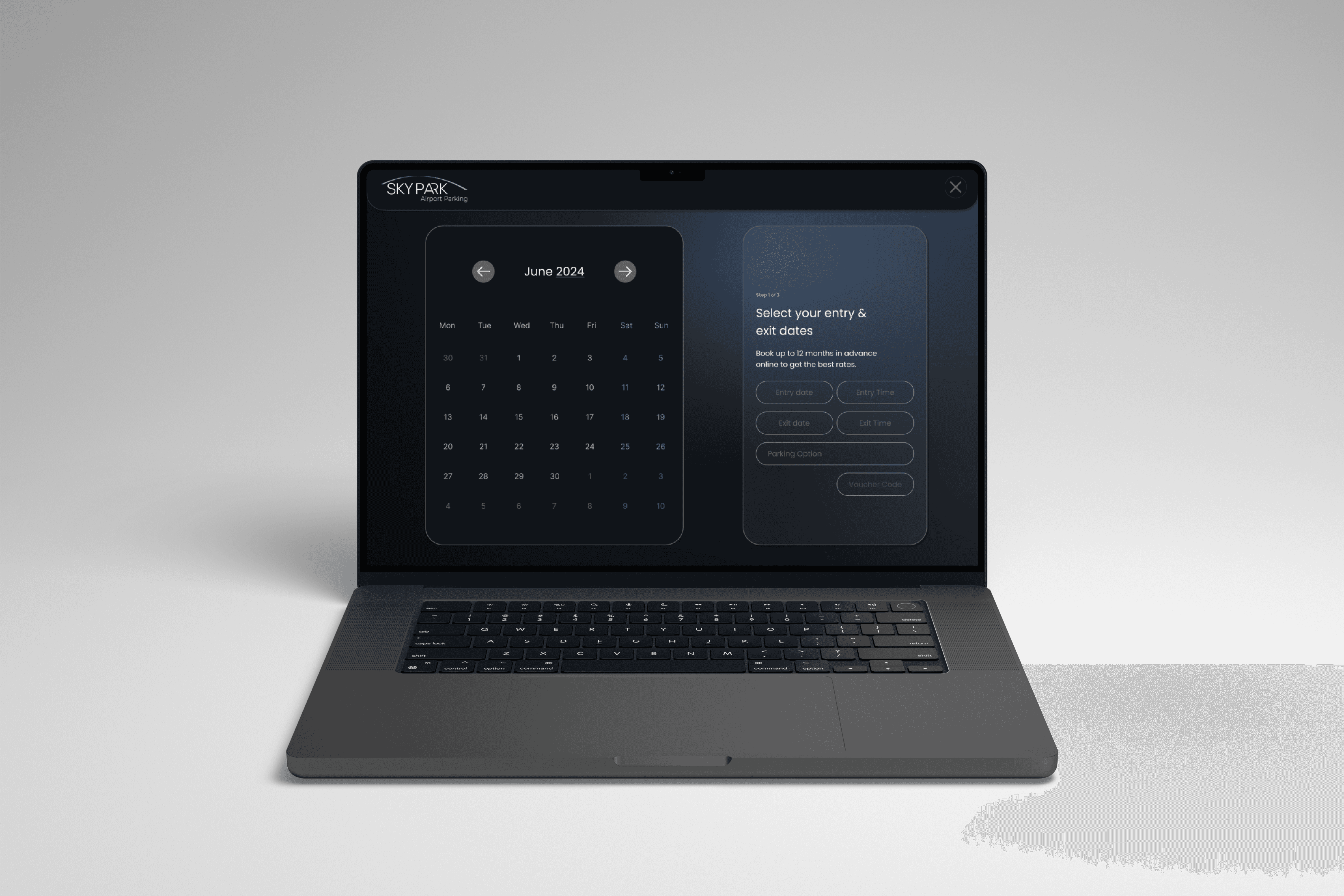
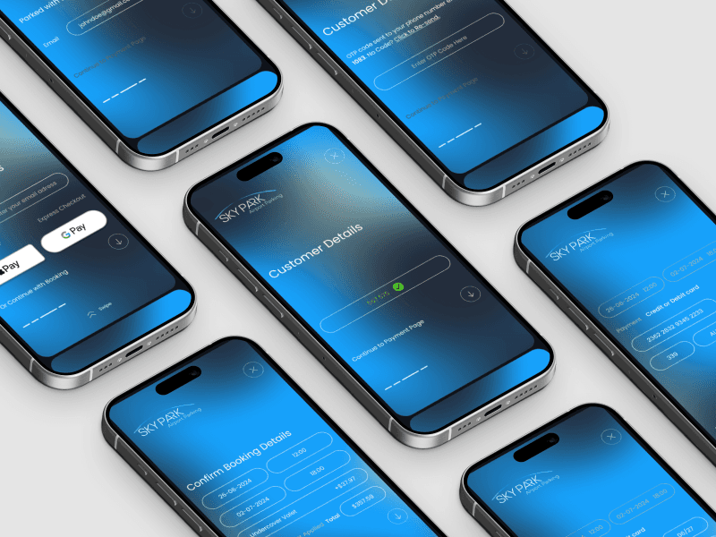
We redesigned the mobile booking platform with a task-oriented, screen-by-screen structure that mimics the intuitiveness of native mobile apps. Instead of overwhelming users with a dense, form-based layout, the new design introduces:
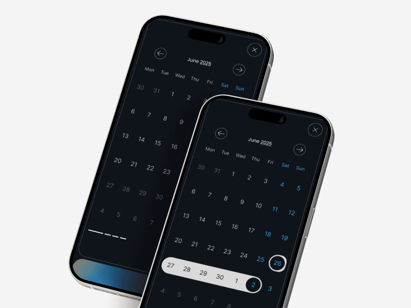
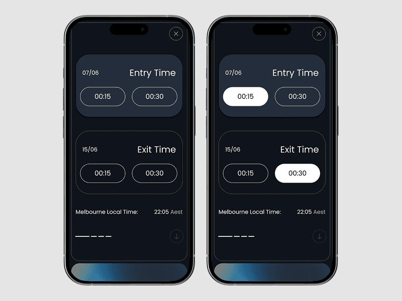
Progressive flow segmentation – breaking booking into digestible steps (date/time, parking type, contact info, confirmation)
Context-aware transitions – only surfacing relevant inputs at each stage
Mobile-native patterns – tap-friendly buttons, anchored CTAs, inline validation, and bottom-sheet style selectors
Microinteractions and error feedback – guiding users through each step with visual reassurance and system responses
Reduced scroll fatigue by eliminating unnecessary input redundancy and prioritising tap-driven progress
Outcome
The restructured mobile experience led to:
Increased form completion rates, especially during high-traffic periods
Sharp drop in booking errors, particularly in date/time entry
Improved session retention, with lower bounce rates on mobile entry points
Higher perceived trust, supported by embedded reviews and step-by-step clarity
A mobile flow that feels app-like, reduces user hesitation, and improves end-to-end booking confidence