Pizza Identity
Designing a shelf-stable pizza brand with real edge — not frozen hype.
Industry
Food
Client
Based Pizza
Service
Brand Identity
Date
March 2024
Challenge
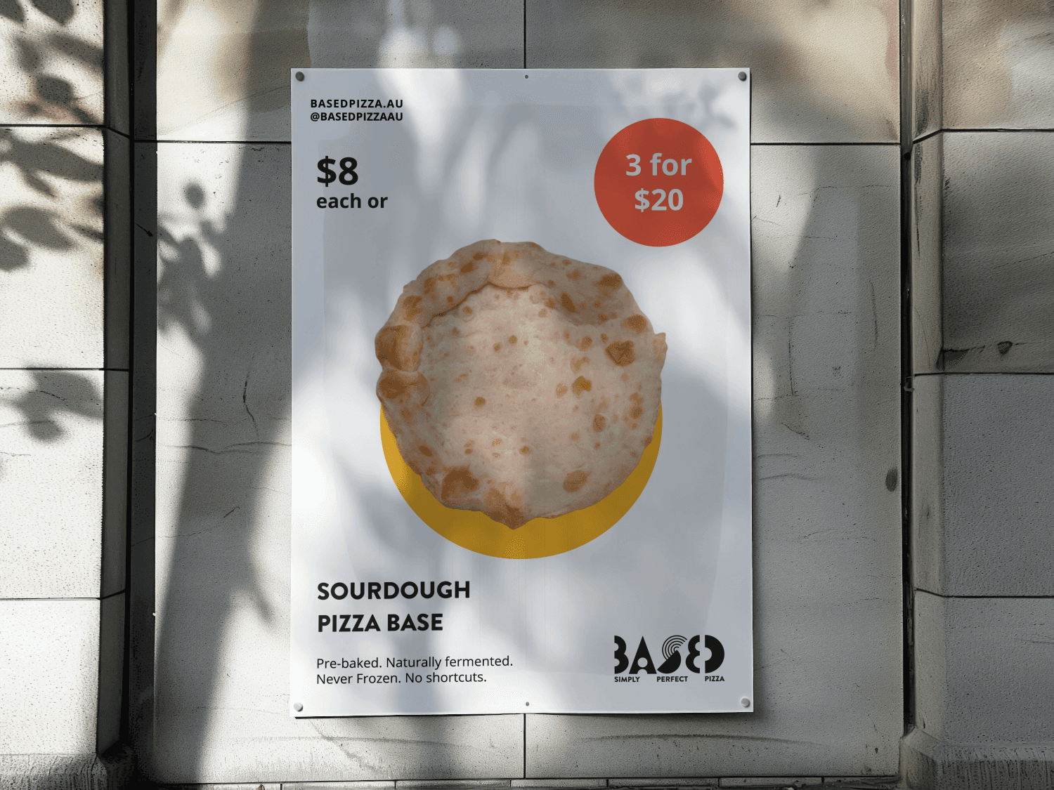
Based Pizza was launching a new kind of product: a high-protein, long-life sourdough pizza base with no preservatives. It was functional, healthy, and designed for chefs — but everything in the category looked like diet food or cheesy family pizza night.
The brand needed to feel modern, sharp, and undeniably different — something that could live in both a chef’s kitchen and a creator’s studio. No fake rustic vibes. No health-food clichés. No neon “artisan” trends.
Just real design for a real product.

Approach
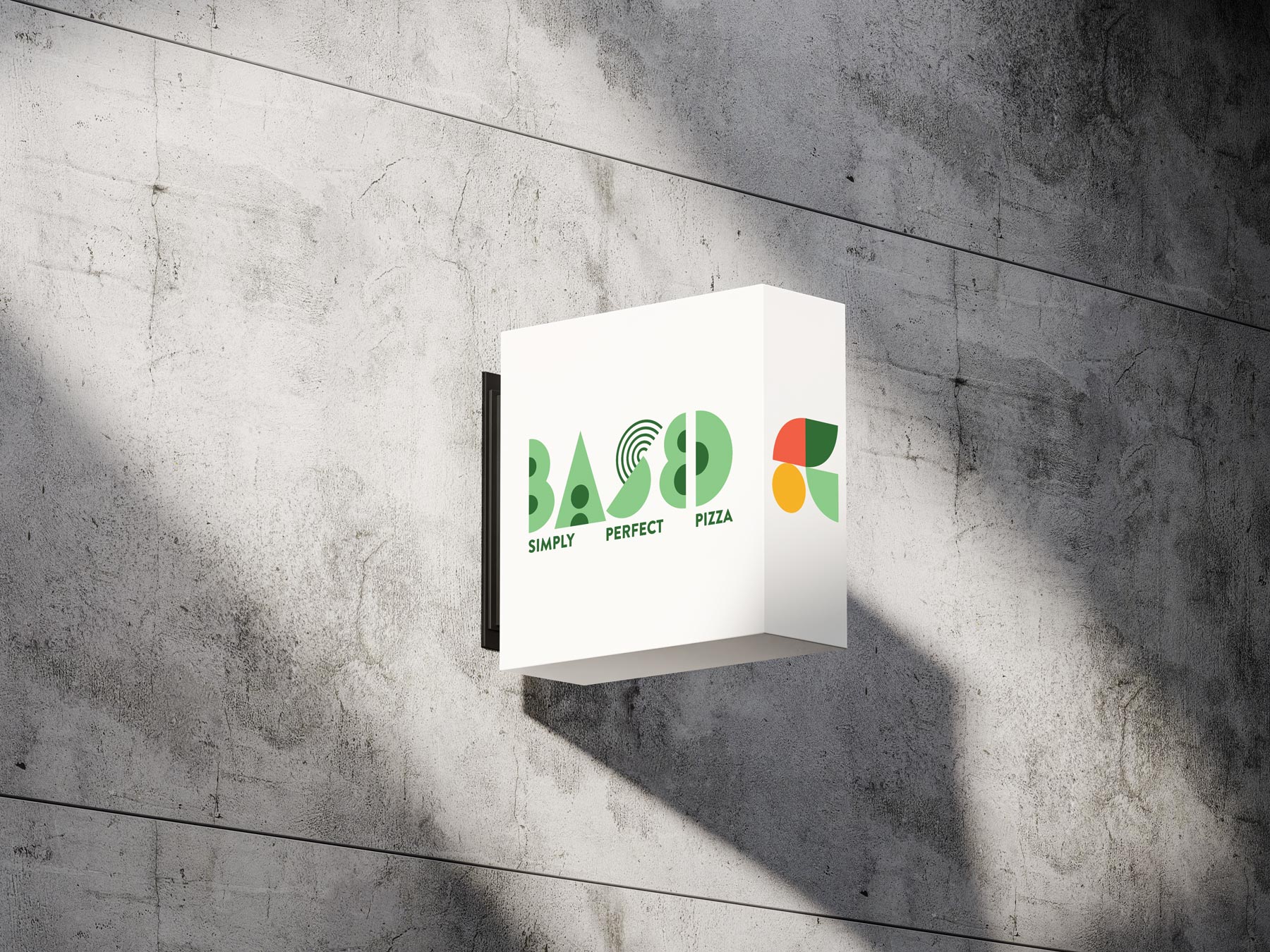
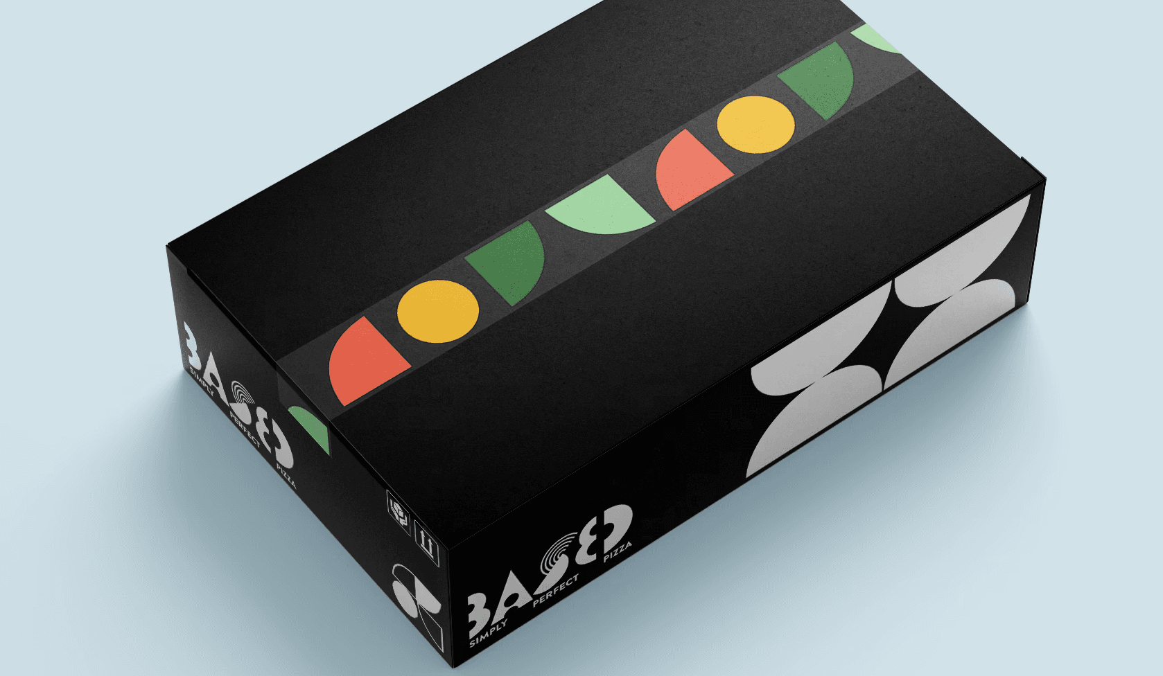
I built the identity around a Bauhaus-inspired visual language — geometric, clean, and systemised. The logo is bold and typographic, designed to work across packaging, web, apparel, and shipping boxes.
Typography is tight and structured. The colour system is modular — letting the product line expand while staying recognisable. Everything is built to feel premium without pretending to be fancy.
I treated the brand like a product design tool: functional, extendable, honest.
Applications included:
Box and vacuum-pack label design
Tape, sticker, and merch systems
Social and email visuals
Visual guidance for future signage and retail
Outcome
The brand launched retail at the Good Food & Wine Show, selling over 1,500 bases in a weekend — with customers consistently saying, “Wait, this looks sick. What is this?”
Retail buyers and chefs gravitated toward the packaging for its clarity and shelf presence. The identity now supports the brand’s expansion into e-commerce, wholesale, and content-led marketing without needing a single redesign.